The adaptive design system for Tailwind CSS.
Skeleton uses Tailwind as the foundation for building adaptive design systems. Including turnkey components for your favorite web frameworks.
Complete the form to get started.
Notifications
Review each available option.
Team
View all members of the team, or filter using the search field provided.
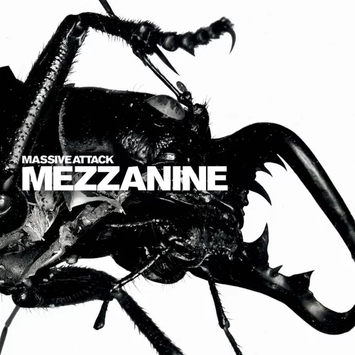
Music
Harman Kardon Luna
Success
Task was completed.
Statistics
64k+
Downloads
↑ 4%93k+
Views
↓ 2.4%15k+
Members
↑ 8%Data represents quarterly metrics for the TPS reports. Updates every 24 hours.
Progression
Revenue
Posted April 1-13
Delivery
Size
Material
Invoice Paid
You paid $14,276. Receipt submitted to:
me@email.com
| Selected | Symbol | Name | Weight |
|---|---|---|---|
| Fe | Iron | 26 | |
| Rh | Rhodium | 45 | |
| I | Iodine | 53 | |
| Rn | Radon | 86 | |
| Tc | Technetium | 43 |
Set Reminder
Contributions
+1,248
+150% increase
Pink Floyd
Another Brick in the Wall
3:16
Design System
Themes are empowered by CSS custom properties, enabling simple integration into Tailwind. Register multiple themes and easily switch on demand.
[data-theme='cerberus'] {
    --spacing: 0.25rem;
    --text-scaling: 1.067;
    --base-font-color: var(--color-surface-950);
    --base-font-color-dark: var(--color-surface-50);
    --base-font-family: system-ui;
    --base-font-size: inherit;
    --base-line-height: inherit;
    --base-font-weight: normal;
    --base-font-style: normal;
    --base-letter-spacing: 0em;
    --heading-font-color: inherit;
    --heading-font-color-dark: inherit;
    --heading-font-family: inherit;
    --heading-font-weight: bold;
    --heading-font-style: normal;
    --heading-letter-spacing: inherit;
    --anchor-font-color: var(--color-primary-500);
    --anchor-font-color-dark: var(--color-primary-400);
    --anchor-font-family: inherit;
    --anchor-font-size: inherit;
    --anchor-line-height: inherit;
    --anchor-font-weight: inherit;
    --anchor-font-style: inherit;
    --anchor-letter-spacing: inherit;
    --anchor-text-decoration: none;
    --anchor-text-decoration-hover: underline;
    --anchor-text-decoration-active: none;
    --anchor-text-decoration-focus: none;
Tailwind Components
Common visual interfaces, such as cards, buttons, and tables. Using semantic HTML elements and Tailwind utility classes.
Framework Components
Interactive components for supported frameworks. Handle state and logic for user interaction and form elements.
And Even More...
Solve the hard problems at scale. Skeleton comes with an assortment of quality of life features out of the box.
Easy to Use
Core features such as themes and utility classes require a single dependency — Tailwind CSS.
Built with Zag.js
Battle tested cross-framework components with standardized features, a11y, and i18n.
Integrations
Easily extend Skeleton using our friendly guides for icons, code blocks, and more.
Adaptive Design
Create interfaces that automatically adapt to your theme's colors, fonts, and overall aesthetic.
Dark Mode
Integrated support for Tailwind's powerful dark mode and color scheme mechanisms.
Typescript
Type-safe by default, providing helpful IntelliSense feedback as you work.


![renovate[bot]](https://avatars.githubusercontent.com/in/2740?v=4)


![github-actions[bot]](https://avatars.githubusercontent.com/in/15368?v=4)


Open Source
Tended by Skeleton Labs and provided under the flexible MIT License. Join our vast community of open source volunteers and start contributing today!
150k+
Total Monthly Downloads
5k+
GitHub Stars
2k+
Discord Members
Sponsor Us
Projects like Skeleton exist through the generosity of our community. Help fund the project, while receiving fun incentives in return. Available on the following services.