This article was created in cooperation with Skeleton contributor Dominik.
One of Skeleton's core tenets is to keep form elements as close to their native counterparts as possible. In most cases we feel this offers the best user experience and accessibility story for your users, allowing critical interface elements to adapt to their environments as needed.
In Skeleton v0.124.2 we've update all form components to take full advantage of SvelteKit's recently introduced native form features - including the use:enhance directive and SubmitFunction form handler.
What's New?
The following Skeleton components have received updates:
- File Buttons - now act as
input[type='file']elements. - File Dropzones - now act as
input[type='file']elements. - Input Chips -now act as
selectelements. - Listboxes - act as
input[type='checkbox']orinput[type='radio'] - Radio Groups - now act as
input[type='radio']elements. - Range Sliders - now act as
input[type='range']elements. - Slide Toggles - now act as
input[type='checkbox']elements
Bind Syntax
Previously many Skeleton form components relied heavily on Svelte writable store to control the state of the component. While this was useful for providing two way data binding for the Context API, the state management for form components could become muddy in forms.
Given this, we've now modeled our state entry points against native inputs in Svelte. You can now use either the bind:value={myValue} or bind:group={myGroupValue} syntax. And don't worry, stores are still available if you prefer, just opt for the bind:value={$myStore} or bind:group={$myStore} instead.
$ sign!Please be aware that you may not always need bind. Bind adds two-way data binding to your values. If you're only passing data down, say from your route (parent) to component (child), then you can likely discard this.
Demo Project
In order to see the new components in action, we'll create a simple form. Let's generate a new project, create a basic form, then discuss how each form component operates.
Create a New Project
Create a new Skeleton project using the Skeleton CLI:
npm create skeleton-app@latest my-skeleton-project
    - Choose "Yes, using Typescript syntax"
    - Select "No" for ESLint, Prettier, Playwright, Vitest, Inspector
    - Per Tailwind plugins, select the Forms plugin (required!)
    - Select any theme
    - Select the "Bare Bones" template
cd my-skeleton-project
npm run dev -- --open
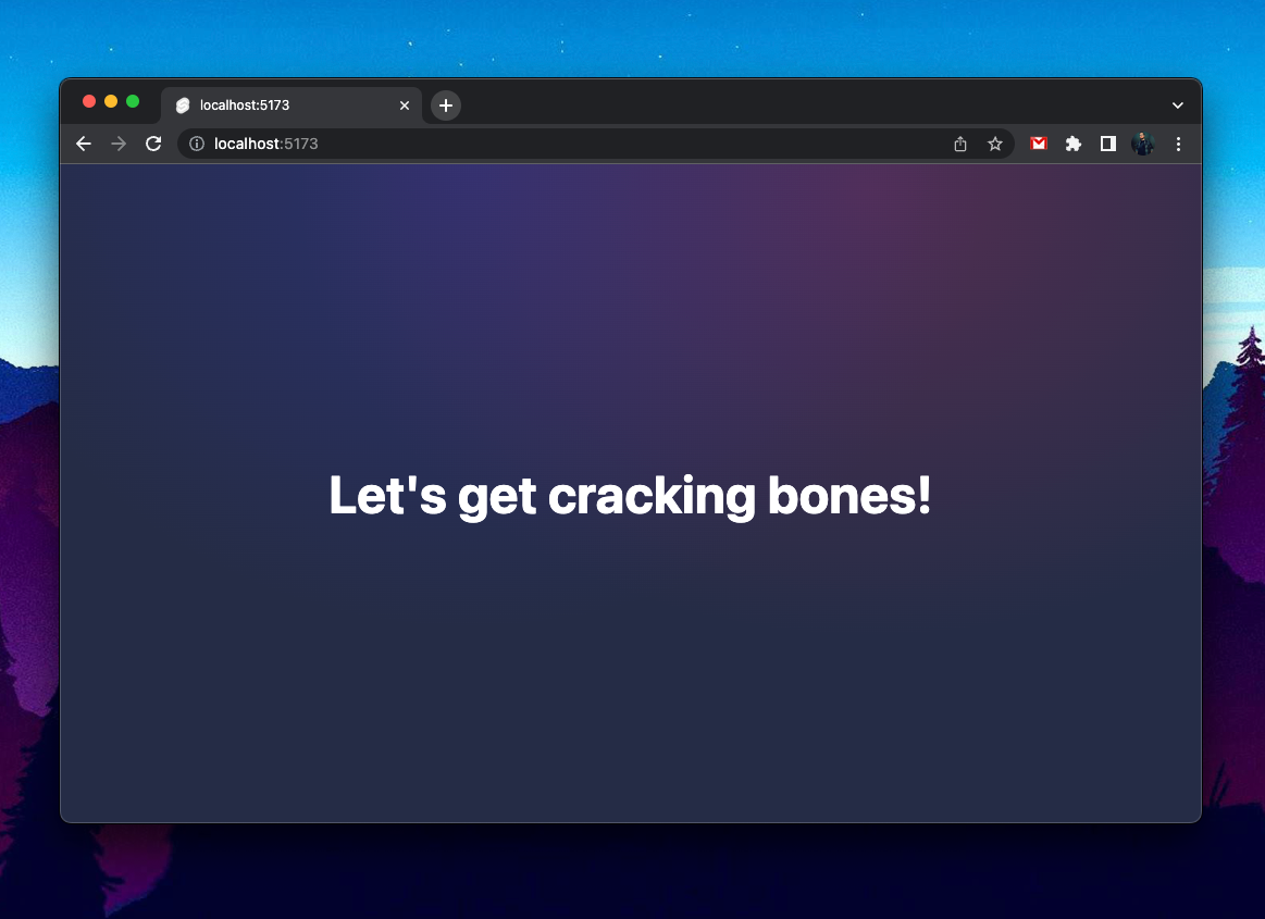
Open the project in your text editor of choice and ensure your local dev server is running. You'll be met with some basic styles and welcome message:

Implement the Form
Open your root layout in /src/routes/+layout.svelte and add the following wrapping main element and styles.
<main class="max-w-[600px] mx-auto p-10">
    <slot />
</main>
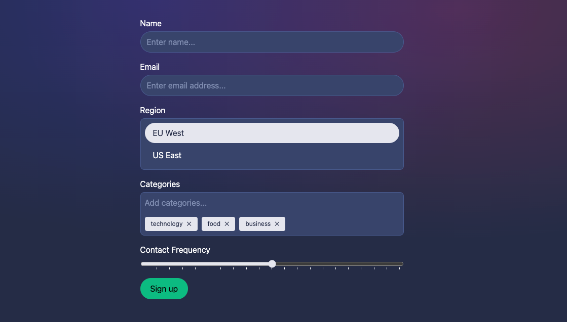
Open your homepage in /src/routes/+page.svelte and add the following. This will include our form elements, default form values, and setup a form handler via use:enhance.
<script lang="ts">
	import { enhance, type SubmitFunction } from '$app/forms';
	import { InputChip, ListBox, ListBoxItem, RangeSlider } from '@skeletonlabs/skeleton';

	// Local Data
	const defaults = {
		region: 'eu-west',
		categories: ['technology', 'food', 'business']
	};
	const formData = {
		region: defaults.region,
		categories: defaults.categories,
		frequency: 50
	};

	// Doc: https://kit.svelte.dev/docs/types#public-types-submitfunction
	const onFormSubmitHandler: SubmitFunction = () => {
		// Clear by reseting defaults
		formData.region = defaults.region;
		formData.categories = defaults.categories;
		return async ({ update }) => {
			await update(/* { reset: false } */); // set `reset` false to persist existing fields
		};
	};
</script>

<!-- Doc: https://kit.svelte.dev/docs/form-actions#progressive-enhancement-use-enhance -->
<form method="POST" use:enhance={onFormSubmitHandler} class="space-y-4">
	<label class="label">
		<span>Name</span>
		<input class="input" name="name" type="text" placeholder="Enter name..." />
	</label>
	<label class="label">
		<span>Email</span>
		<input class="input" name="email" type="email" placeholder="Enter email address..." />
	</label>
	<label for="region" class="label">
		<span>Region</span>
		<ListBox class="input rounded-container-token p-2">
			<ListBoxItem bind:group={formData.region} name="region" value="eu-west">EU West</ListBoxItem>
			<ListBoxItem bind:group={formData.region} name="region" value="us-east">US East</ListBoxItem>
		</ListBox>
	</label>
	<label for="categories" class="label">
		<span>Categories</span>
		<InputChip name="categories" bind:value={formData.categories} placeholder="Add categories..." />
	</label>
	<label for="frequency" class="label">
		<span>Contact Frequency</span>
		<RangeSlider name="frequency" bind:value={formData.frequency} max={100} step={5} ticked />
	</label>
	<button class="btn variant-filled-primary">Sign up</button>
</form>
Finally, let's generate a new page server file in /src/routes/+page.server.ts and add the server-side code that implements our SvelteKit Form Actions.
import type { Actions } from '@sveltejs/kit';

export const actions: Actions = {
	default: async (event) => {
		const formData = await event.request.formData();
		// NOTE: this will log in your terminal (the server), not the browser
		console.log(formData);
		formData.get('chips');
	}
};
Submission
When pressing "Sign Up" all our form data will be submitted to the page server. If we log the results we'll see our name and value data.
{ name: 'name', value: 'Dominik' },
{ name: 'email', value: 'test@skeleton.dev' },
{ name: 'region', value: 'EU West' },
{ name: 'categories', value: 'technology' },
{ name: 'categories', value: 'food' },
{ name: 'categories', value: 'business' },
{ name: 'frequency', value: '50' }
Note that the name attribute is what the form uses to identify each element. This is now required for all Skeleton form components. You'll see a red squiggle warning if you do not include this.
Skeleton Components
Let's review how each Skeleton component used within the form.
Listboxes
With default settings, the Listbox component will act as a radio input. This means only one option may be selected at a time.
<ListBox class="input rounded-container-token p-2">
	<ListBoxItem bind:group={formData.region} name="region" value="eu-west">EU West</ListBoxItem>
	<ListBoxItem bind:group={formData.region} name="region" value="us-east">US East</ListBoxItem>
</ListBox>
You may also notice similarities to a native radio input in Svelte, including the use of bind:group, name, and value attributes.
<label>
	<input type="radio" bind:group={formData.region} name="eu-west" value="eu-west">
	EU West
</label>
Input Chips
This component uses the bind:value syntax and requires a unique name. This uses a native select under the hood to manage state. Each chip is an option set to the selected.
<InputChip name="categories" bind:value={formData.categories} ... />Range Slider
Likewise the Ranger Slider uses the bind:value syntax and requires a unique name. Under the hood state is managed via an input[type='range'] and includes native datalist to add tick marks in supported browsers.
<RangeSlider name="frequency" bind:value={formData.frequency} ... />Handling Group FormData
Be aware that when using group FormData within Form Actions, such as Listbox bind:group data, you'll will need to make use of FormData.getAll.
The getAll() method of the FormData interface returns all the values associated with a given key from within a FormData object.
By default the data will be submitted to the server as separate objects, like so:
{ name: 'chips', value: 'paprika' },
{ name: 'chips', value: 'salt & pepper' },
{ name: 'chips', value: 'salt & vinegar' },
If we use FormData.get() in your server-side Action, we'll only receive the first entry in the set, such as 'paprika'.
To get a proper array of our group data, we'll need to use the getAll() method. Our data will then display as: ['paprika', 'salt & pepper', 'salt & vinegar'].
export const actions: Actions = {
  default: async (event) => {
    const formData = await event.request.formData();

    // Wrong
    let selectedChipFlavours = formData.get('chips');

    // Correct
    selectedChipFlavours = formData.getAll('chips');
  }
};getAll() method to create an array of bind:group values.Resetting Defaults
One downside to native inputs that are embedded within components is they are not automatically cleared or reset to their default value on submission.
In order to reset these fields, SvelteKit provides the use:enhance directive which can be paired with a Submit Function form handler function. This allows you to intercept and modify the data before it reaches your Form Action. All data entered in the form will be available in the FormData object, which means you're free to immediately reset the component form data as follows:
<form method="POST" use:enhance={onFormSubmitHandler}>...</form>const onFormSubmitHandler: SubmitFunction = () => {
// Reset the Region and Category components to default values
formData.region = defaults.region;
formData.categories = defaults.categories;
// ...
};Official Documentation
While this article covers a lot of ground, there's still plenty to learn about SvelteKit's new form features. We recommend reading through the official documentation to explore each feature in depth.
Project Source Code
Find the source code for this project on GitHub:


